Repositioning a purpose-driven brand by replacing caution with confidence
Client • Etepetete GmbH (D2C)
Year • 2024-2025
Role • Creative Director & Product Director
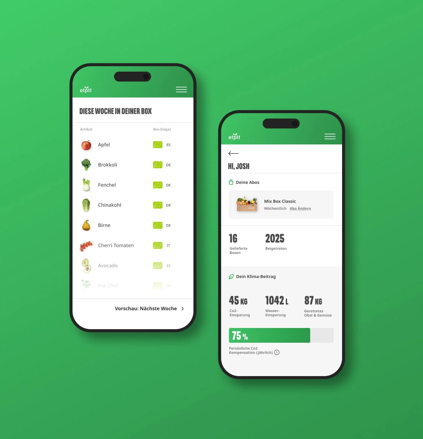
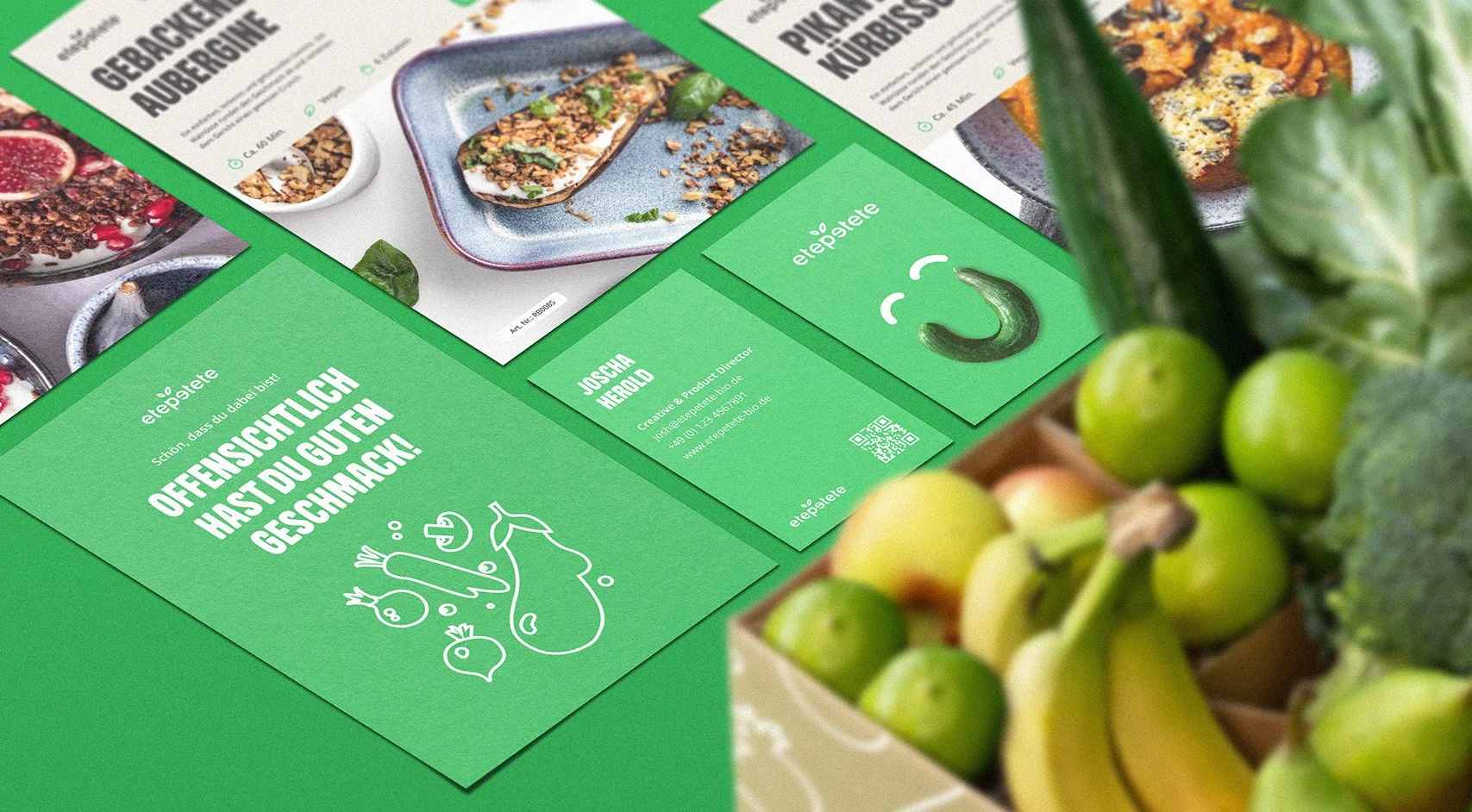
Scope • Brand Development & Repositioning, Content Creation, Packaging Design, UI/UX, Advertising
Team • 8 Crossfunctional (Product, Design, Copy, Social Media, Content)
Duration • 5 Months

The Company
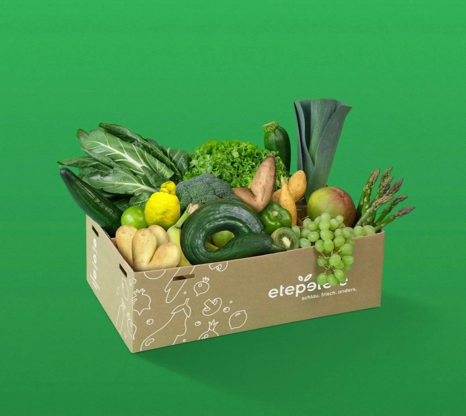
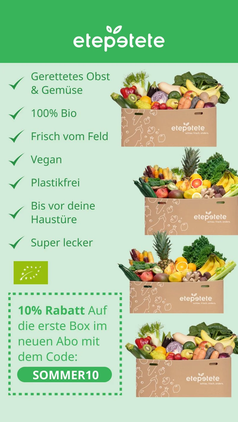
Etepetete is a D2C company dedicated to reducing food waste. The company sources fruit and vegetables from European farmers that do not meet commercial standards due to visual imperfections and therefore do not make it into regular distribution channels. These “rescued” products are shipped directly to end customers via a subscription-based model.
Business Insights (Early 2025)
Founded in 2014
20.000 active subscribers
180.000 Follower on Instagram
7000 weekly shipments
25 Employees
Executive Summary
I led the strategic repositioning of brand and product portfolio. The project unified brand language and marketing assets into a bold, consistent system that transformed a cautious brand into a confident and distinctive voice.
Business Problem
Once a category pioneer, etepetete faced declining differentiation. Despite a strong mission, the brand struggled to convert relevance into growth due to a mismatch between perception, pricing, and its core audience.
Responsibilities
As Creative Director and Director of Product, I led the strategic transformation of brand, product, and customer experience. I prioritized high-impact changes that strengthened brand perception during a broader company stabilization leading a team of eight.
Objective
Evolve etepetete into a purpose-led lifestyle food brand aligned with a values-oriented audience.
Achievements
Successfully realigned the brand and reduced packaging costs through simple product adaptions. Both contributed significantly to a P&L turnover from -6% EBITDA to +4% EBITDA within two years.
Repositioning Framework
1. Assess
Evaluate the brand’s commercial reality, audience, product perception, and competitive position to understand where relevance has been lost.
2. Diagnose
Identify the structural misalignment between brand signals, product value, and the actual paying audience.
3. Strategic Shift
Derive Hypothesises. Define a new positioning that aligns purpose, perception, and market expectations to restore relevance and growth potential.
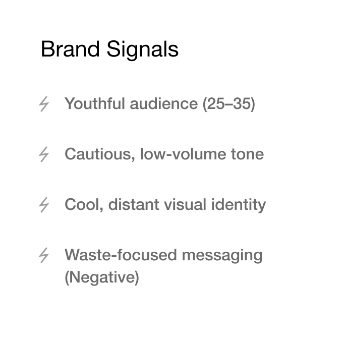
Assess
Who is the brand for?
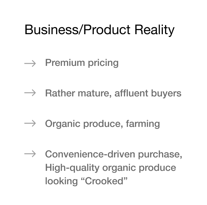
Etepetete targets urban, educated consumers primarily women aged 35 - 45 who view responsible consumption as an expression of their values and are willing to pay a premium price for credible sustainability.
What does the brand stand for?
Etepetete stands for a smarter food system that values resources beyond cosmetic standards, reframing imperfection as efficiency and combining sustainability with uncompromising organic quality.
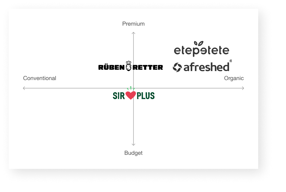
Competitive Landscape
As the pioneer Etepetete created the category and now faces multiple imitators who differentiate through price, technology, or assortment, while Etepetete remains the premium option under higher justification pressure.
Positioning
Etepetete is the original premium brand for rescued organic produce, empowering conscious adults to choose sustainability without compromise.
Diagnose
The brand was built for admirers, not for buyers.
A comprehensive audit revealed a structural misalignment: the brand addressed a young activist audience, while its core customers were older, affluent, and driven by conscious consumption. By overemphasizing ideology at the expense of product quality, the brand attracted attention but failed to resonate with its most valuable segment.
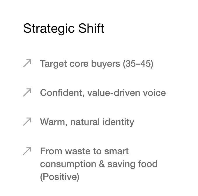
Strategic Shift
From “good waste” to “smarter consumption” through saved produce.
Hypothesis
Sustainability converts when it stops asking for sacrifice and starts delivering quality.
Result
The repositioning shifted the brand from a moral initiative to an intelligent lifestyle choice by reframing sustainability from sacrifice to quality, aligning the mission with a premium audience and strengthening commercial relevance.
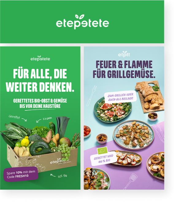
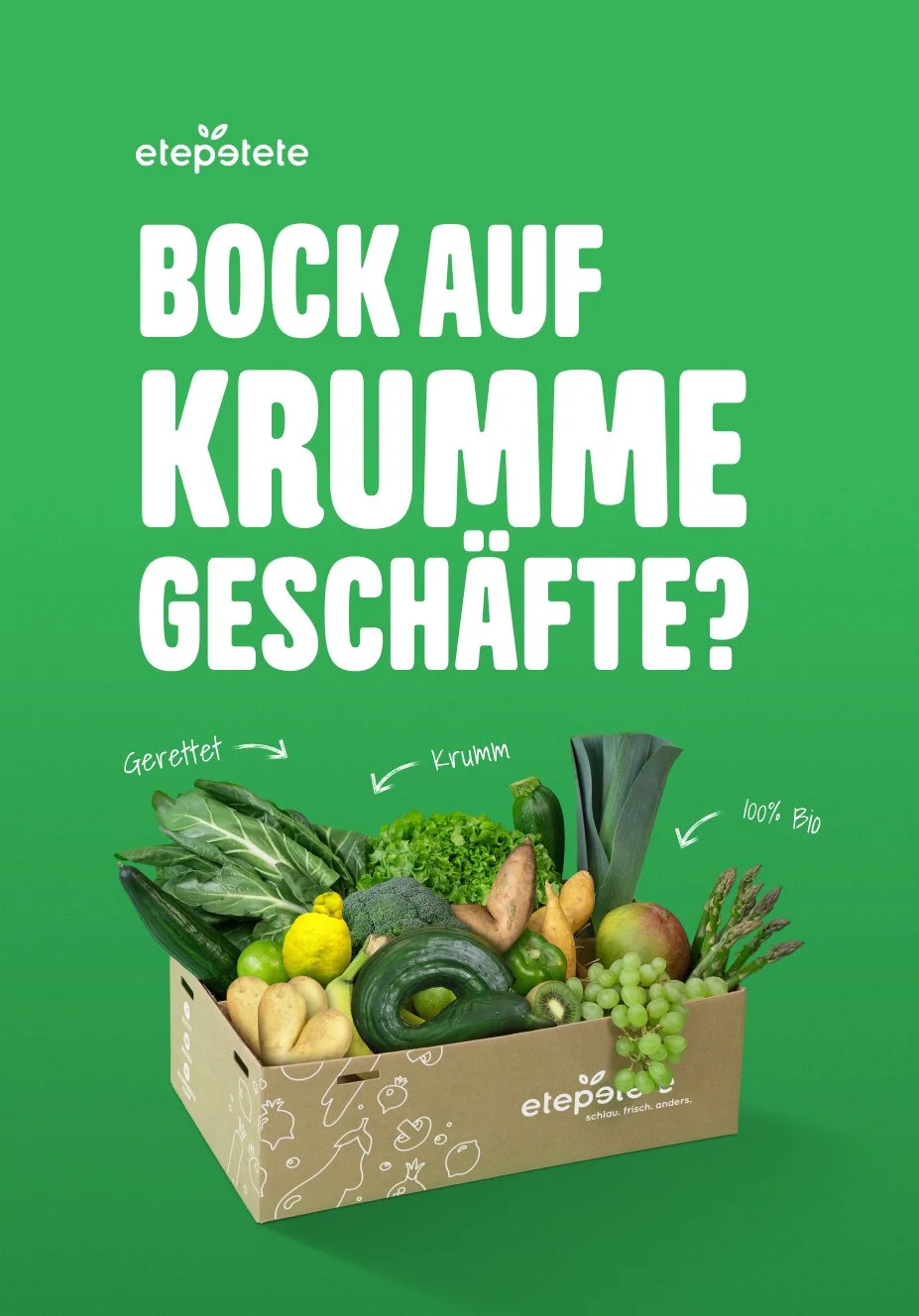
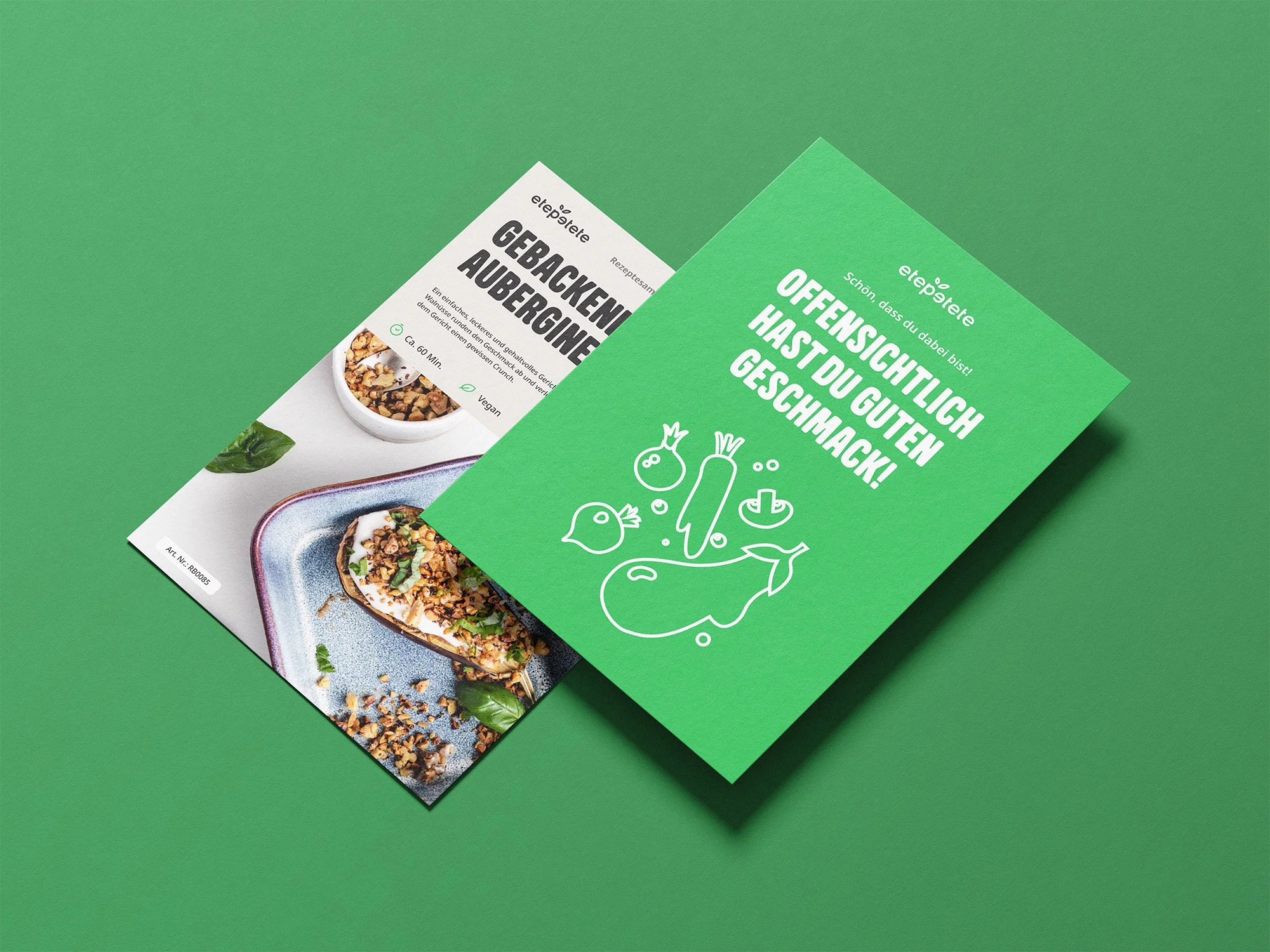
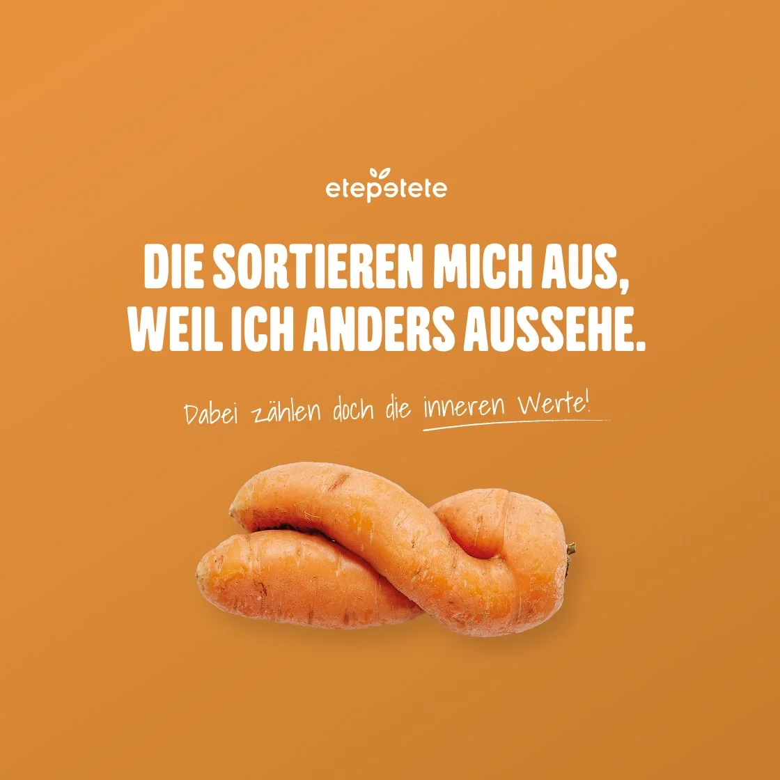
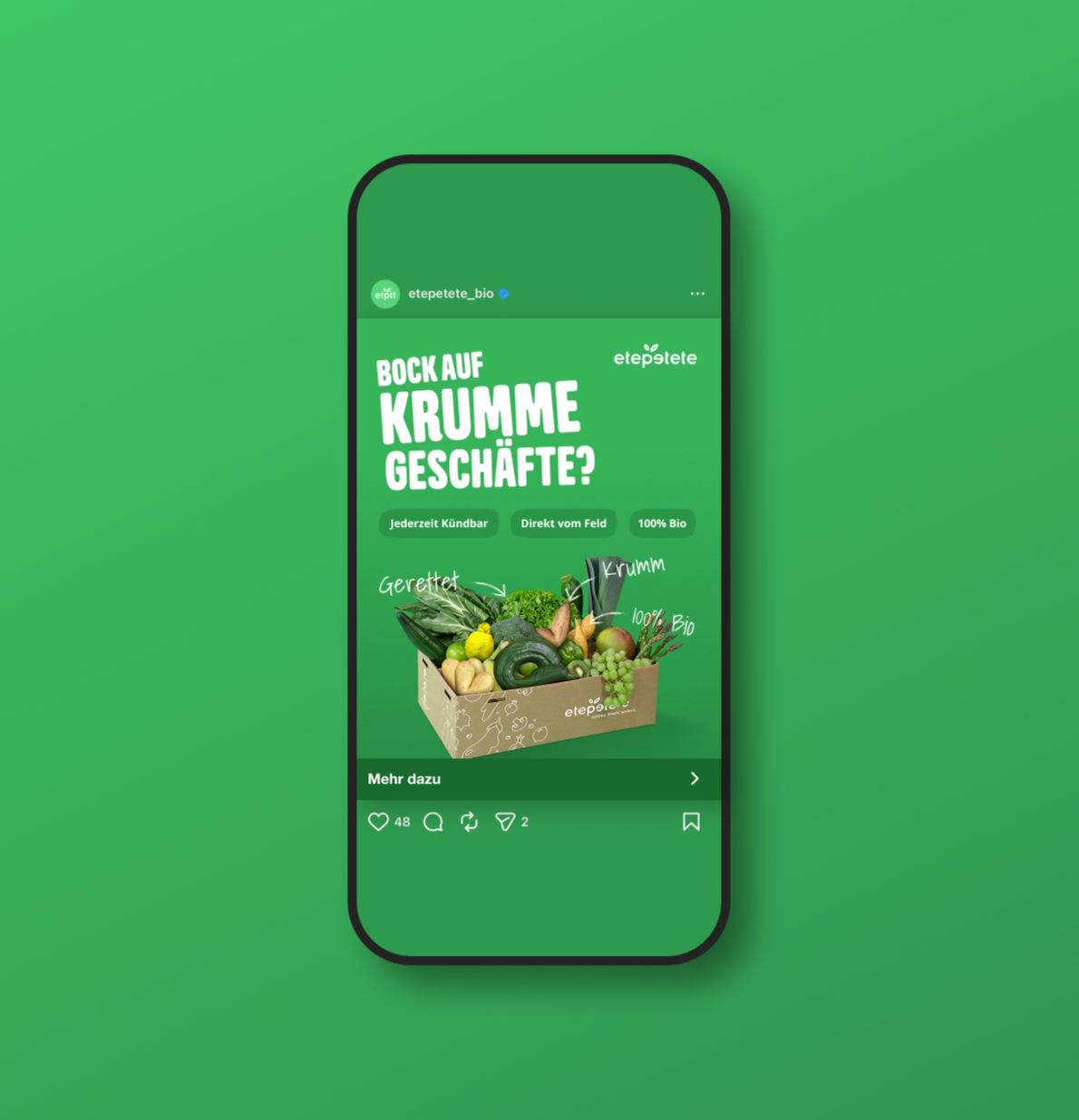
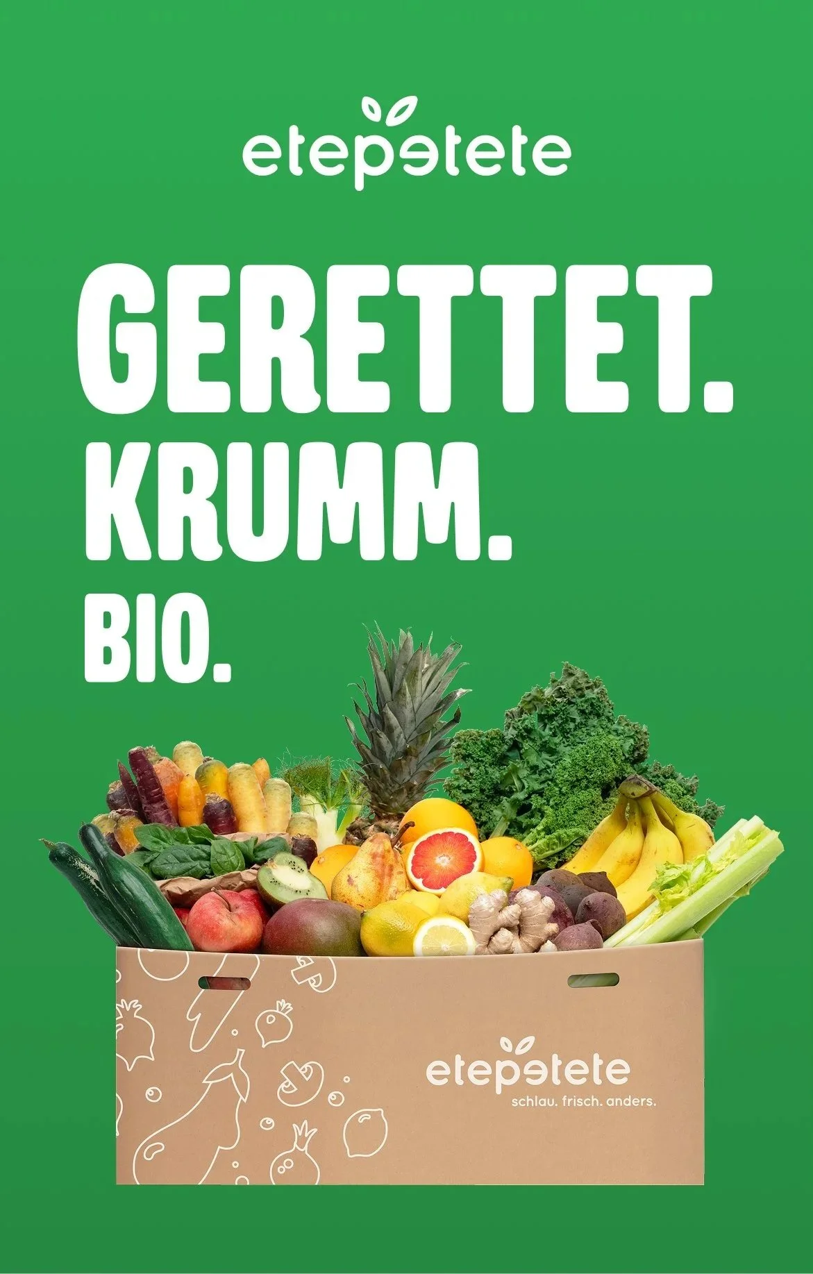
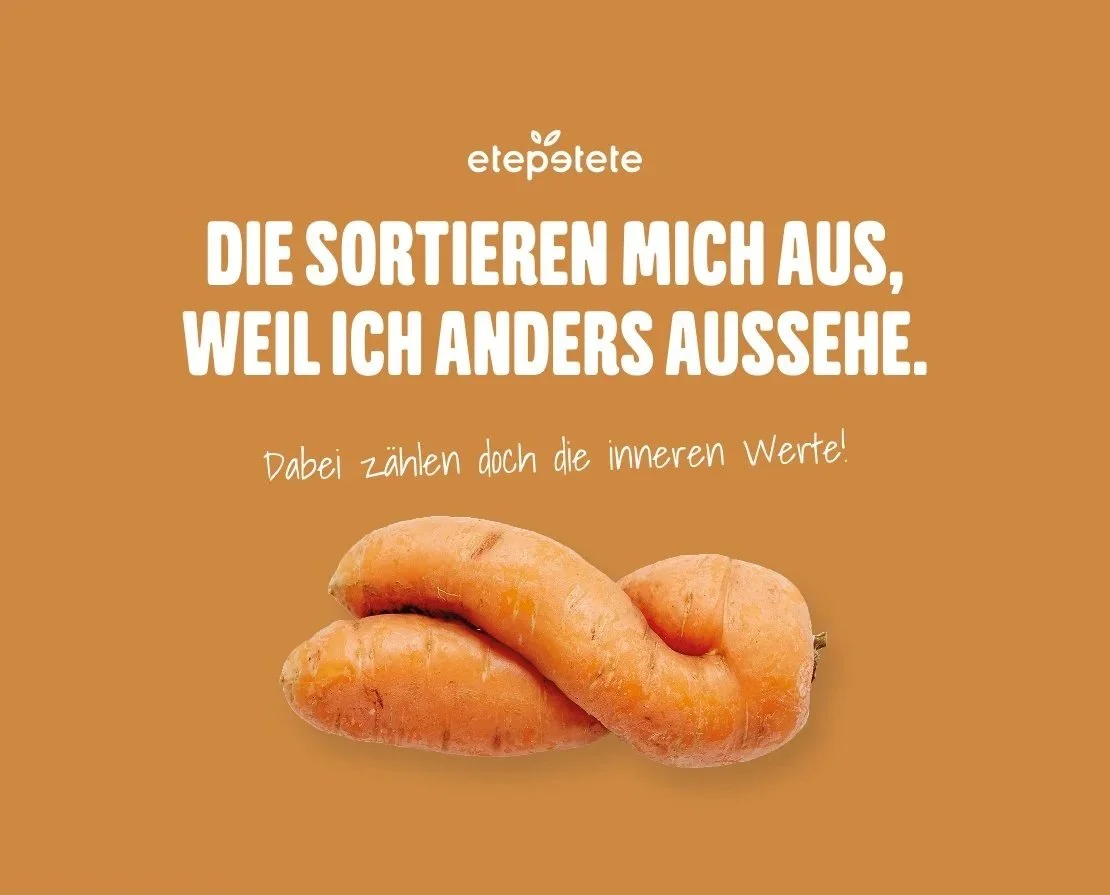
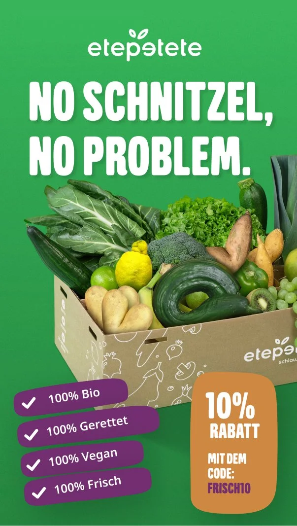
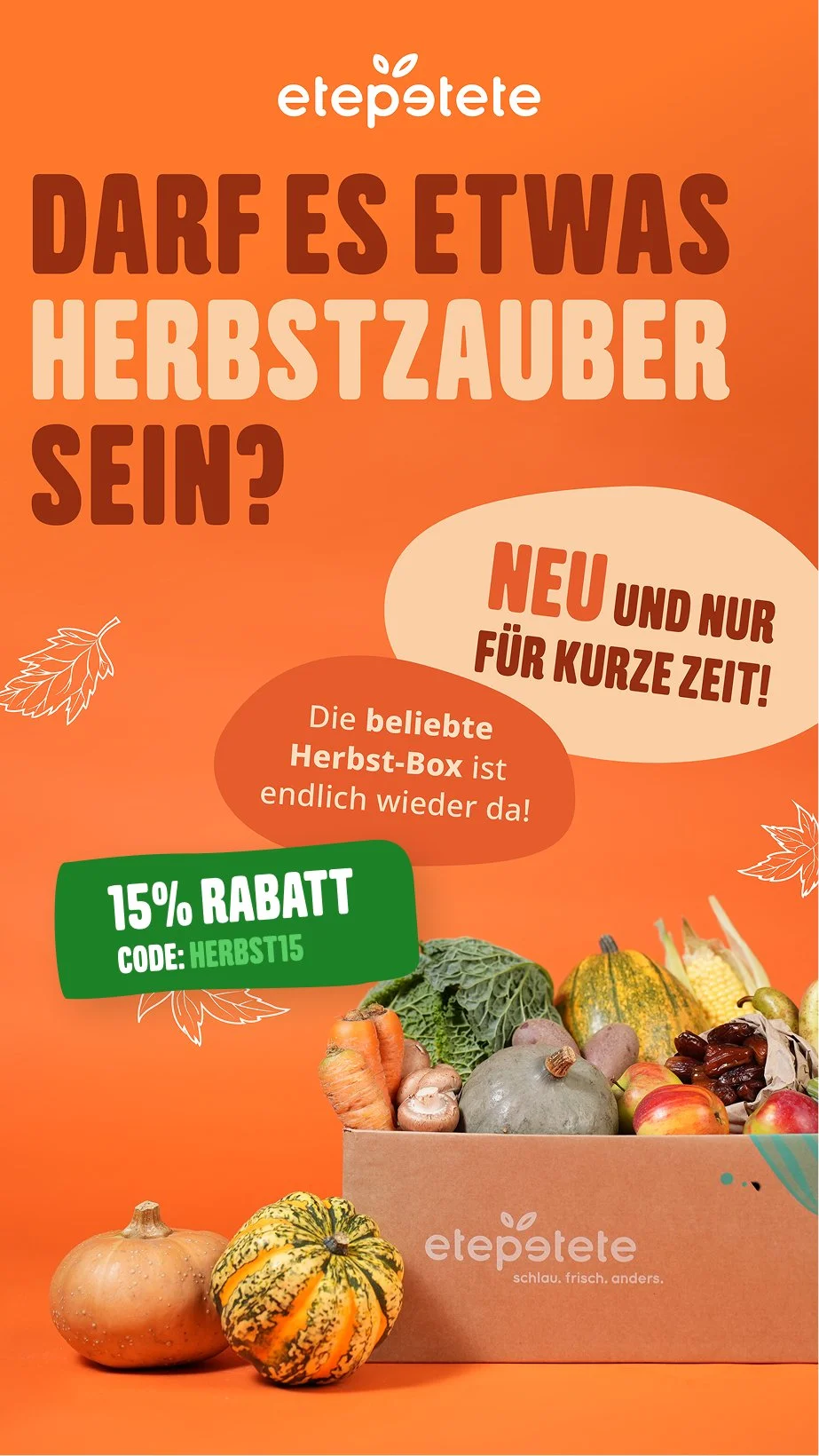
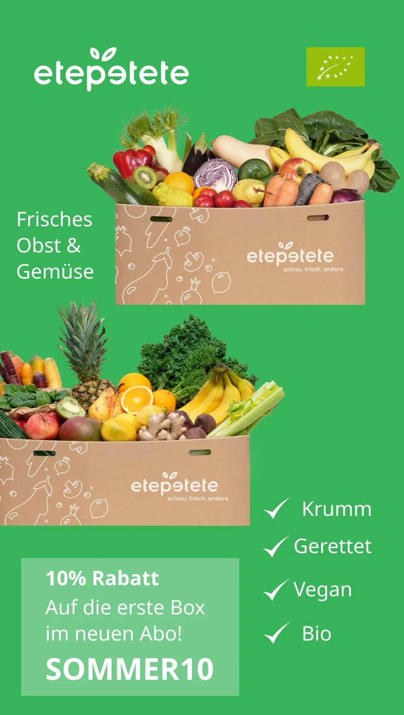
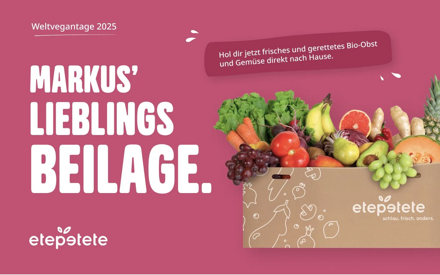
From Caution to Confidence.
Hypothesis
Brands that apologize for their difference never own it.
Result
A cautious tone was diluting the brand's impact. Shifting to bold, direct communication embracing rescued produce's unconventional nature allowed the brand to engage more confidently and turn imperfection into a point of pride.
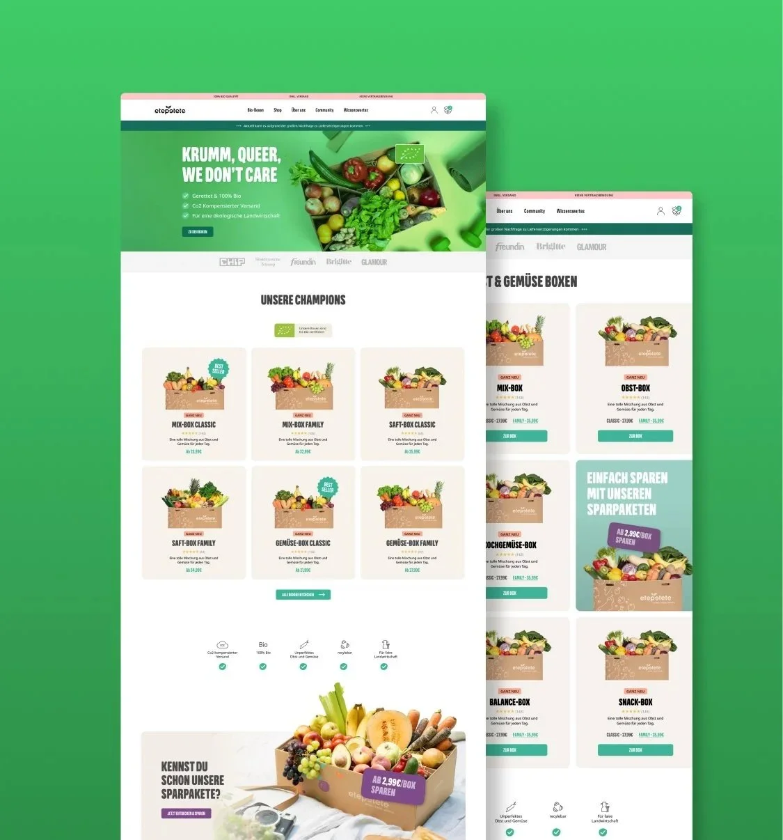
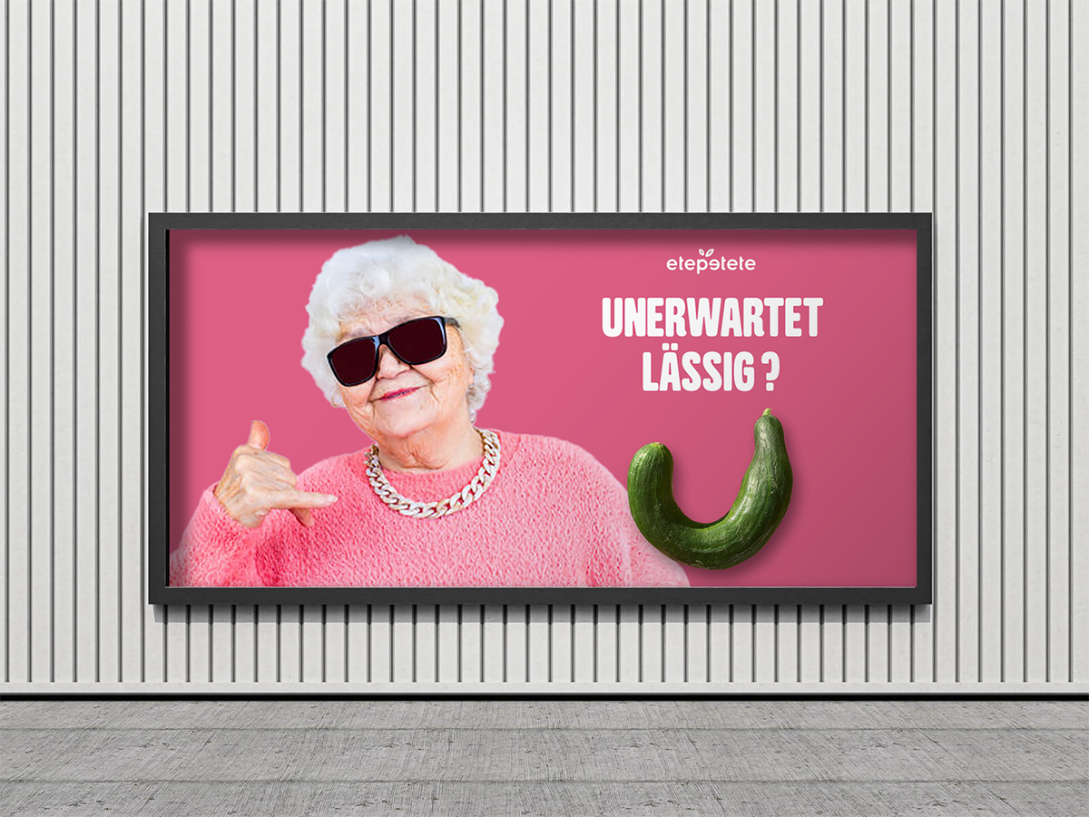
Authentic yet eye-catching.
Hypothesis
Cool tones signal distance the opposite of what drives food purchase decisions. Warmth is a trust mechanism.
Result
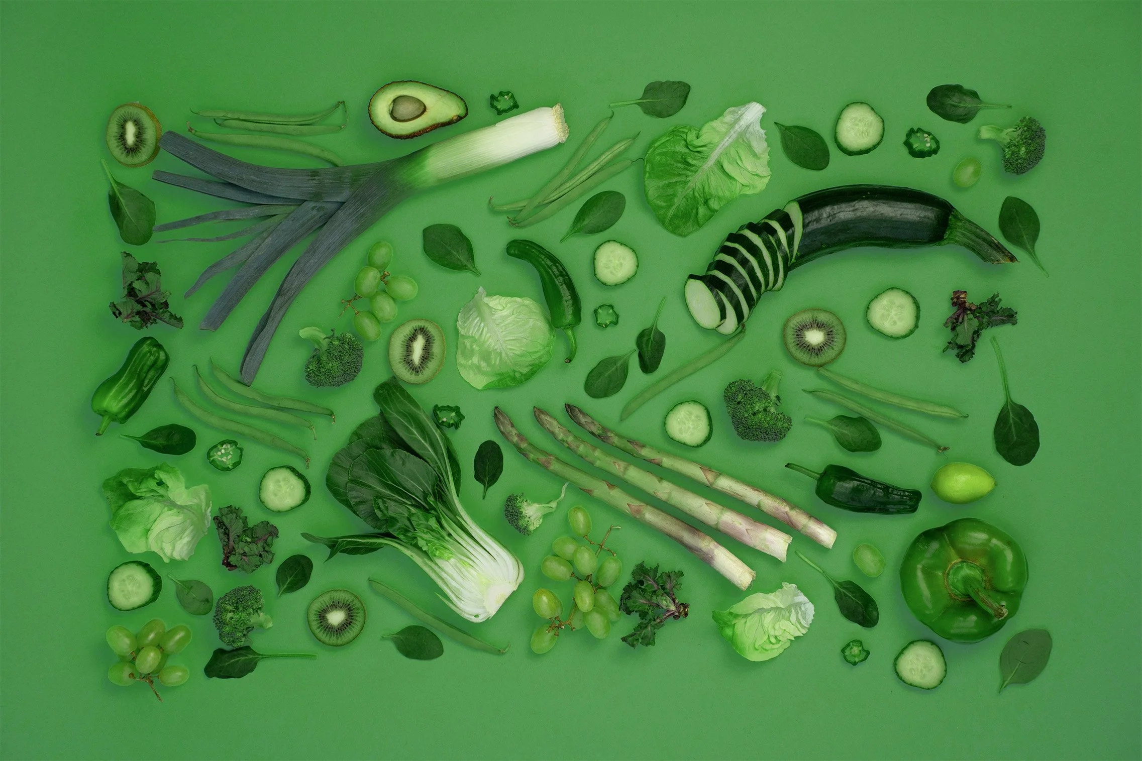
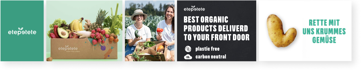
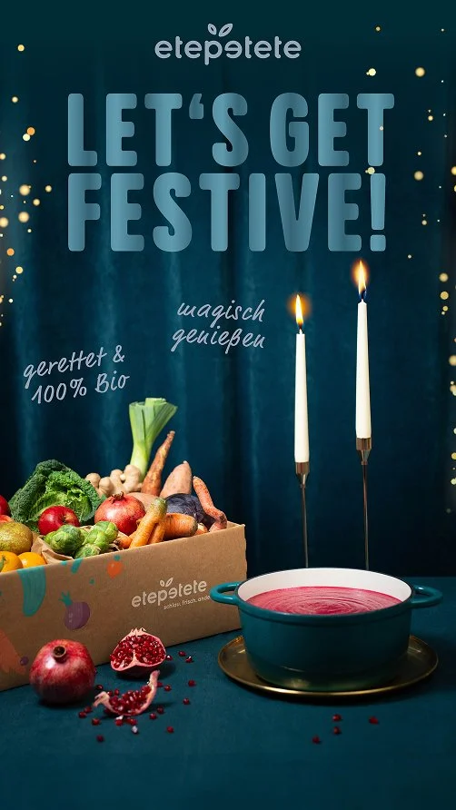
The visual identity shifted from cool and monotonous to warm and inviting. Nature-inspired colors express freshness and optimism, while high-quality assets reinforce a premium yet energetic brand presence.
Before
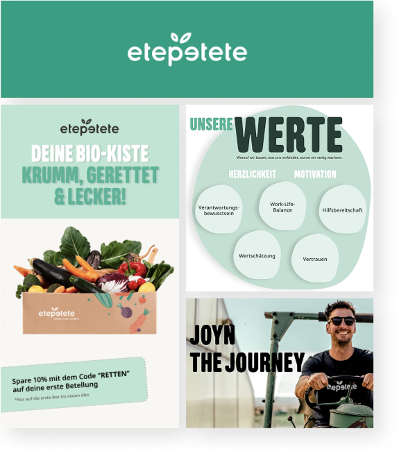
After
Restoring relevance and strategic clarity
The repositioning aligned brand perception, product value, and audience expectations evolving the brand from an admired mission to a preferred category choice. The result: a stronger foundation for growth and a clear identity as a high-quality, purpose-driven alternative rather than a niche activist product.


Brand relevance translated into performance efficiency
Average performance data (2025) indicated clear improvements across key acquisition metrics following the brand update with same budget and seasonal comparison, including higher engagement (CTR +24%), stronger conversion (+16%), and reduced acquisition costs (CAC-12%). While performance was driven by cross-functional efforts, the brand update played a key role in improving message relevance and audience alignment.
Weekly Budget: 50k
Platforms: Meta, Google, Pinterest
Performance Agency
Upper Funnel Campaign
Brief:
Increase top-of-funnel attention.
Goal:
Drive qualified traffic and new customer acquisition while reducing CAC.
Approach:
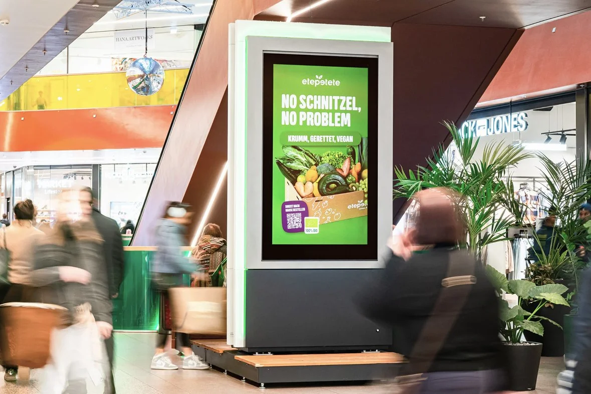
Instead of relying on conventional product presentation, we explored pattern interruption as a core creative principle. The hypothesis was that unexpected framing and reduced visual information would increase thumb-stop rate and engagement in crowded feeds.
Execution:
We developed multiple ad variations based on cropped compositions and provocative, minimal headlines to break established visual patterns.
Result:
The approach outperformed previous creatives and contributed to:
+13% increase in new customers
-9% reduction in CAC
Key Insight:
Breaking expected composition patterns increased attention and engagement, leading to more efficient acquisition.
Mid Funnel Campaign
Brief:
Increase mid-of-funnel attention and improve acquisition efficiency across paid social channels.
Goal:
Drive qualified traffic and new customer acquisition while reducing CAC.
Approach:
Rather than defaulting to category-standard messaging, we introduced a more provocative tone of voice to increase thumb-stop rate. Performance data showed that people-forward imagery weakened conversion, so creative direction prioritized product-first presentation paired with high-relevance USPs.
Execution:
Bold headline copy, assertive product staging, and a clearly hierarchized USP structure designed to reduce friction and guide decision-making.
Result:
The approach outperformed previous mid funnel creatives:
+11% increase in new customers
-6% reduction in CAC
Key Insight:
Disrupting expected category tone of voice combined with a clear visual and messaging hierarchy drives higher attention and lowers cognitive load.


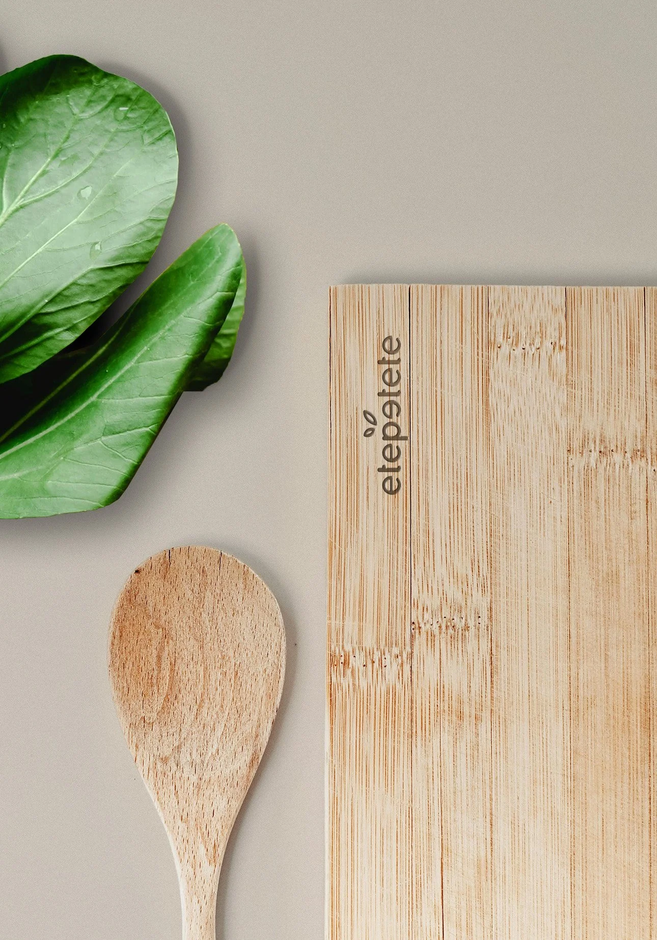
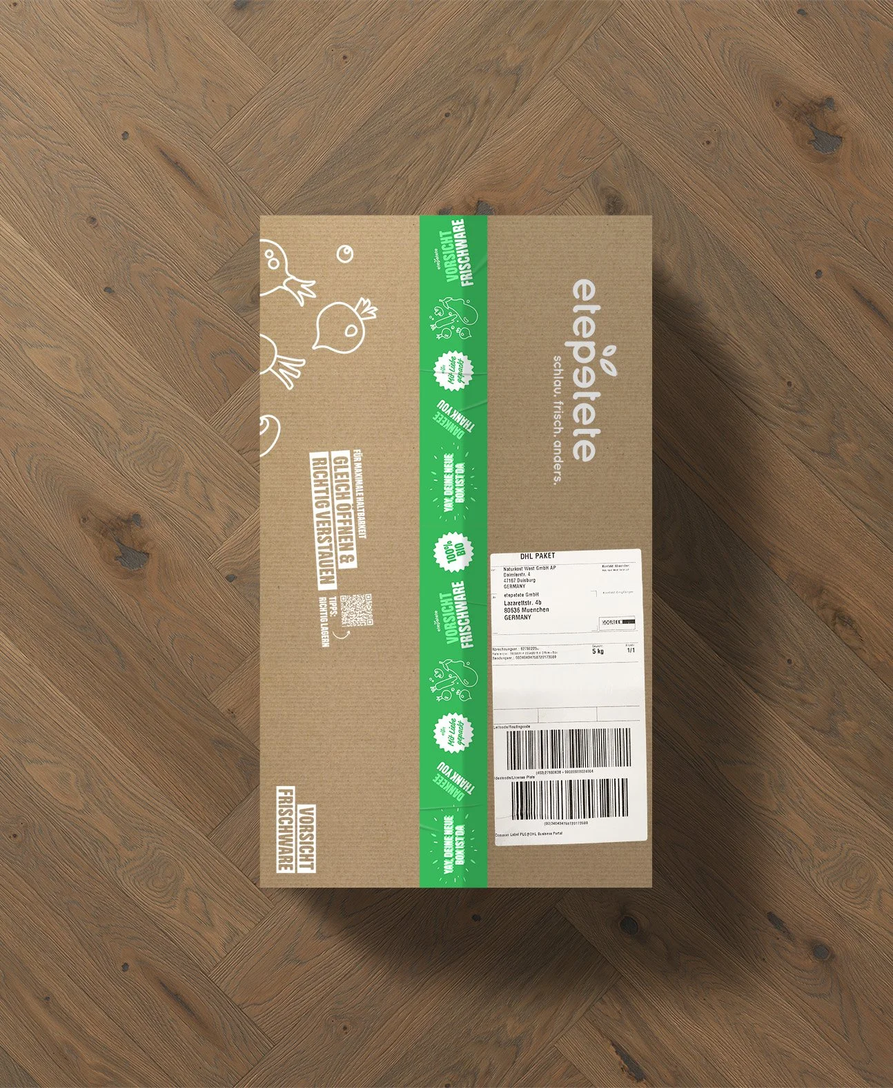
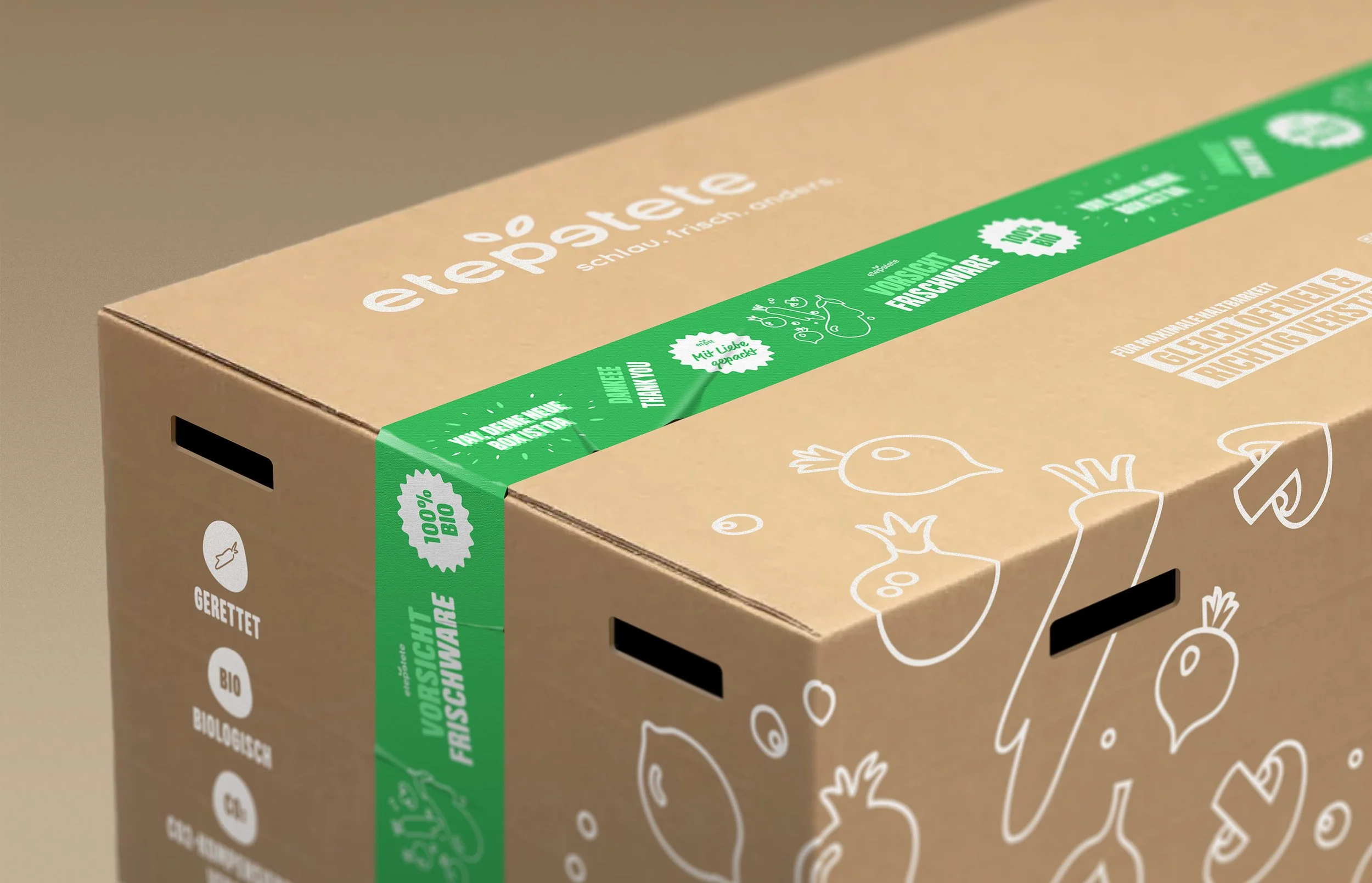
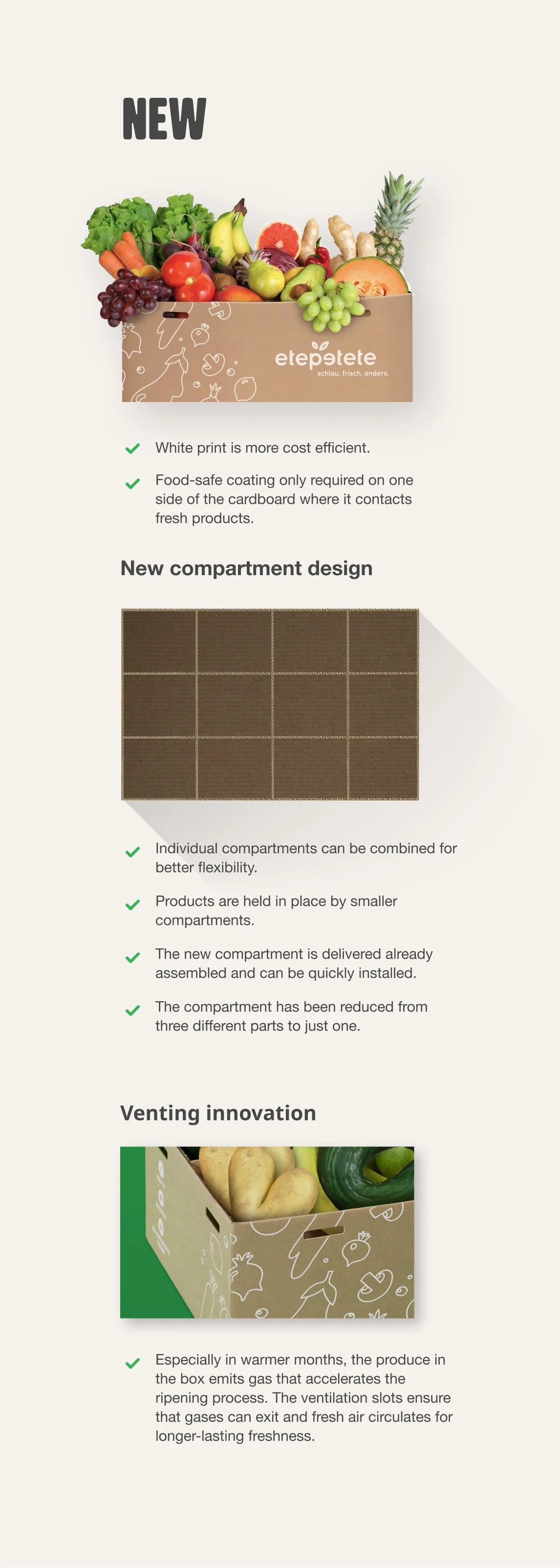
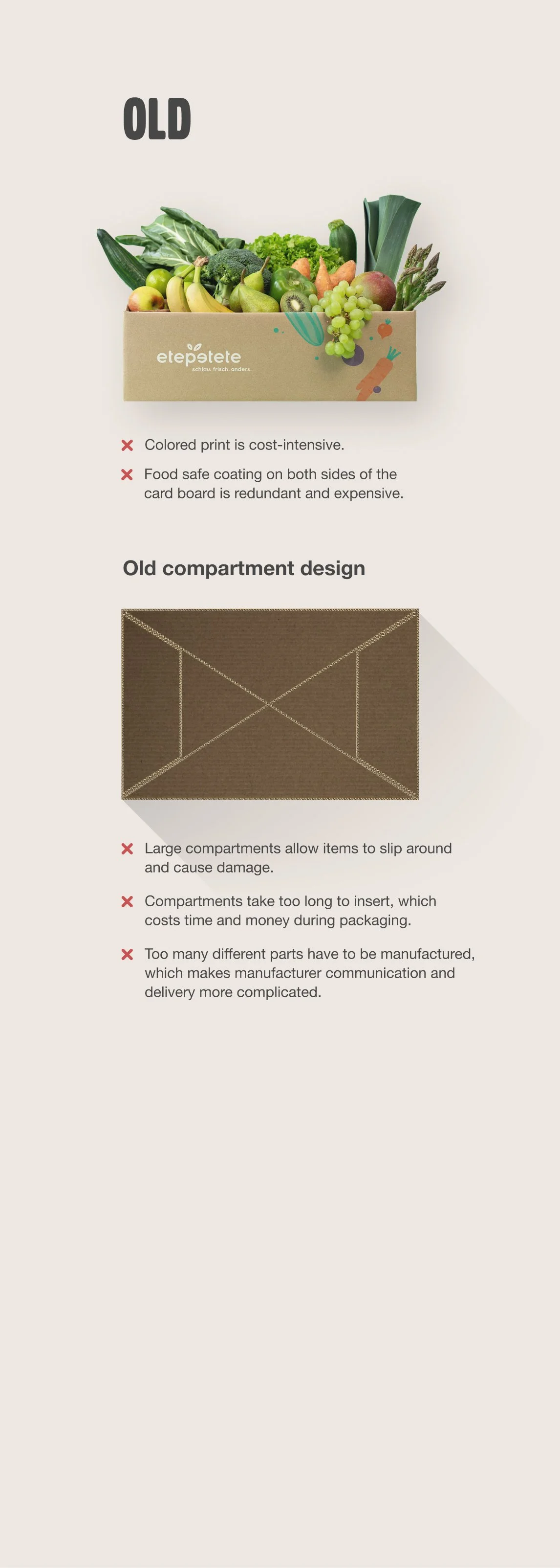
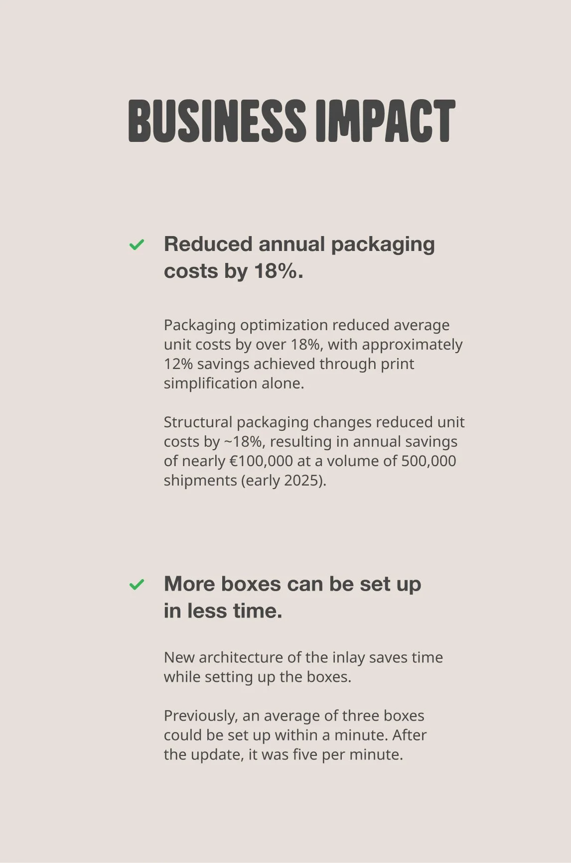
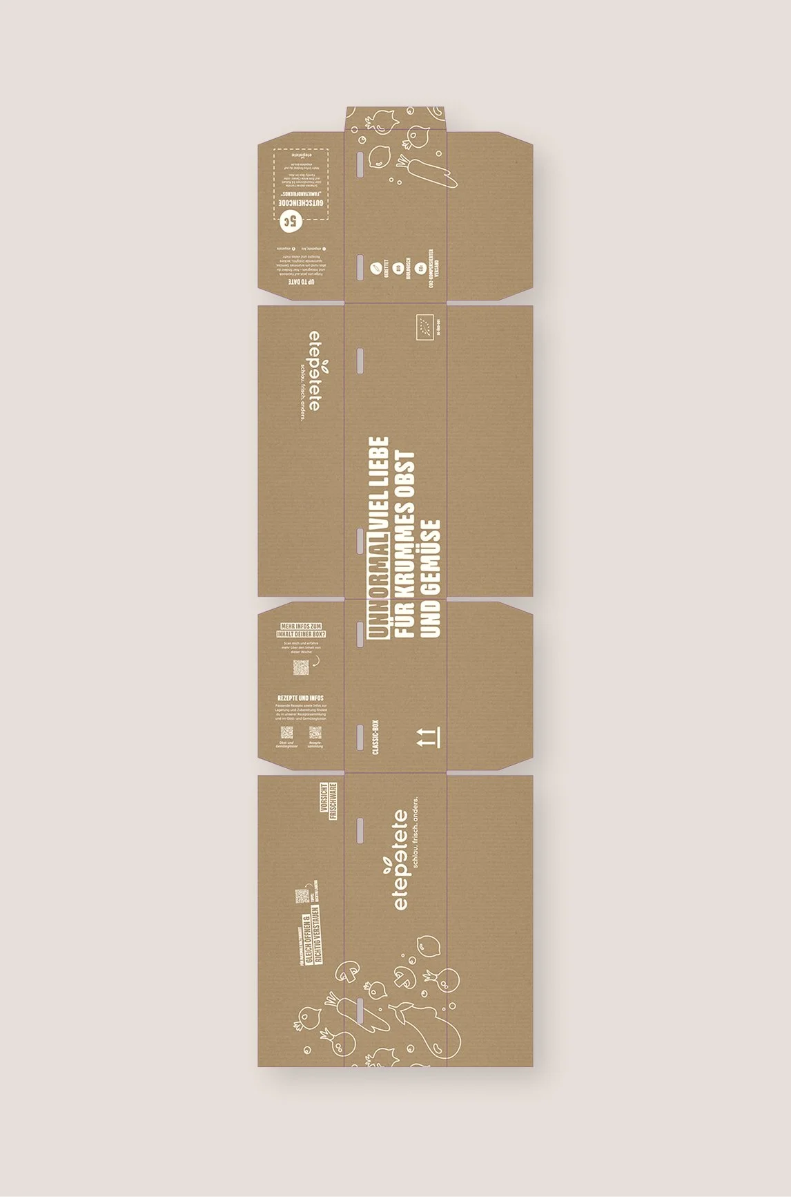
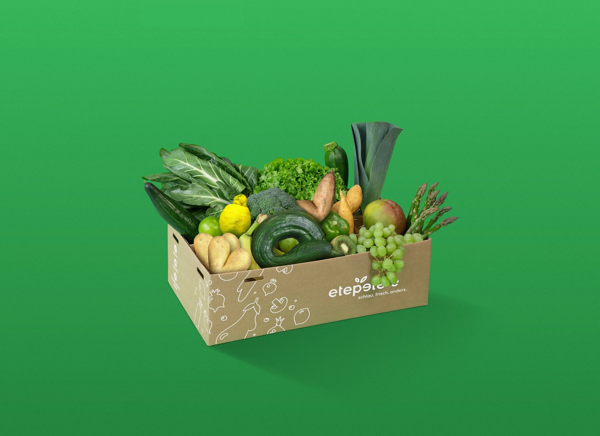
Reengineering packaging design for cost efficiency and operational performance
As part of the rebranding process and as director of product, it was my responsibility to review all touch points not only for brand conformity, but also for cost efficiency and innovation. This packaging redesign serves as an example of how I improve touchpoints in depth. The project resulted in a reduction of annual packaging costs by 18%.

Reflection
Outcome
The repositioning measurably improved brand perception, shifting it from a niche sustainability initiative to a credible premium alternative for the core audience.
Contributed to a P&L turnover from -6% EBITDA to +4% EBITDA within two years.
All major customer touchpoints were aligned under a coherent system, creating a consistent and recognizable brand experience across channels.
Packaging and operational adjustments improved cost efficiency while reinforcing a fresher, more mature visual presence.
The transformation established a scalable strategic foundation that clarified the brand’s role for future growth.
What I would do differently next time
I would involve performance and data teams earlier to validate strategic assumptions faster.
I would invest significantly more time in quantitative and qualitative audience research.
Continuous customer feedback loops during rollout would enable faster iteration and risk reduction.
Key learnings
Effective brand work must start from business and operational realities rather than visual expression alone.
Cross-touchpoint alignment across departments proved more impactful than isolated creative improvements.
Successful repositioning does not always require a full identity overhaul but can be driven by targeted perception shifts.
Deep audience understanding is the most critical input for strategic brand decisions.