Conceptual UX Optimization for Conversion and Clarity
Client • Etepetete GmbH
Year • 2025
Role • Creative Director, Director of Product
Scope • UI/UX, Conversion Optimization
Team • 8 Cross functional (Brand, Design, Marketing, Product)
Duration • 2 Months
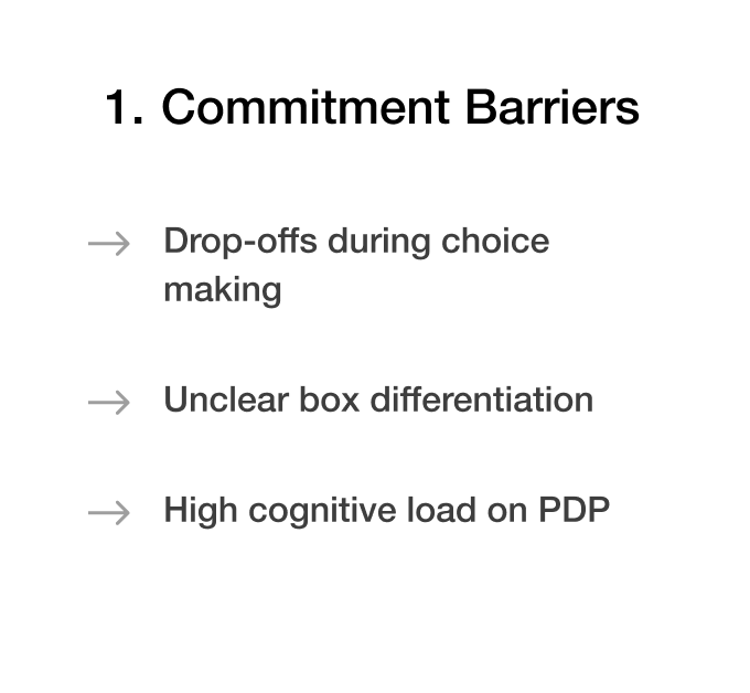
Users were not choosing a product - they were evaluating a recurring commitment.
Context
Conceptual conversion strategy addressing commitment hesitation in a subscription entry journey. Decisions derived from behavioral friction analysis and decision-confidence hypotheses.
Business Problem
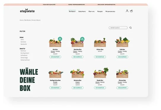
Subscription conversion was constrained by decision uncertainty during product discovery. Users struggled to differentiate box types and configuration options, causing hesitation at the commitment point. Drop off while discovering the PLP and PDP ranged between 60-80%.
Role & Ownership
Led end-to-end strategy across UX, brand, and growth.
Directed an 8-person cross-functional team and aligned stakeholders around a commitment-first approach.
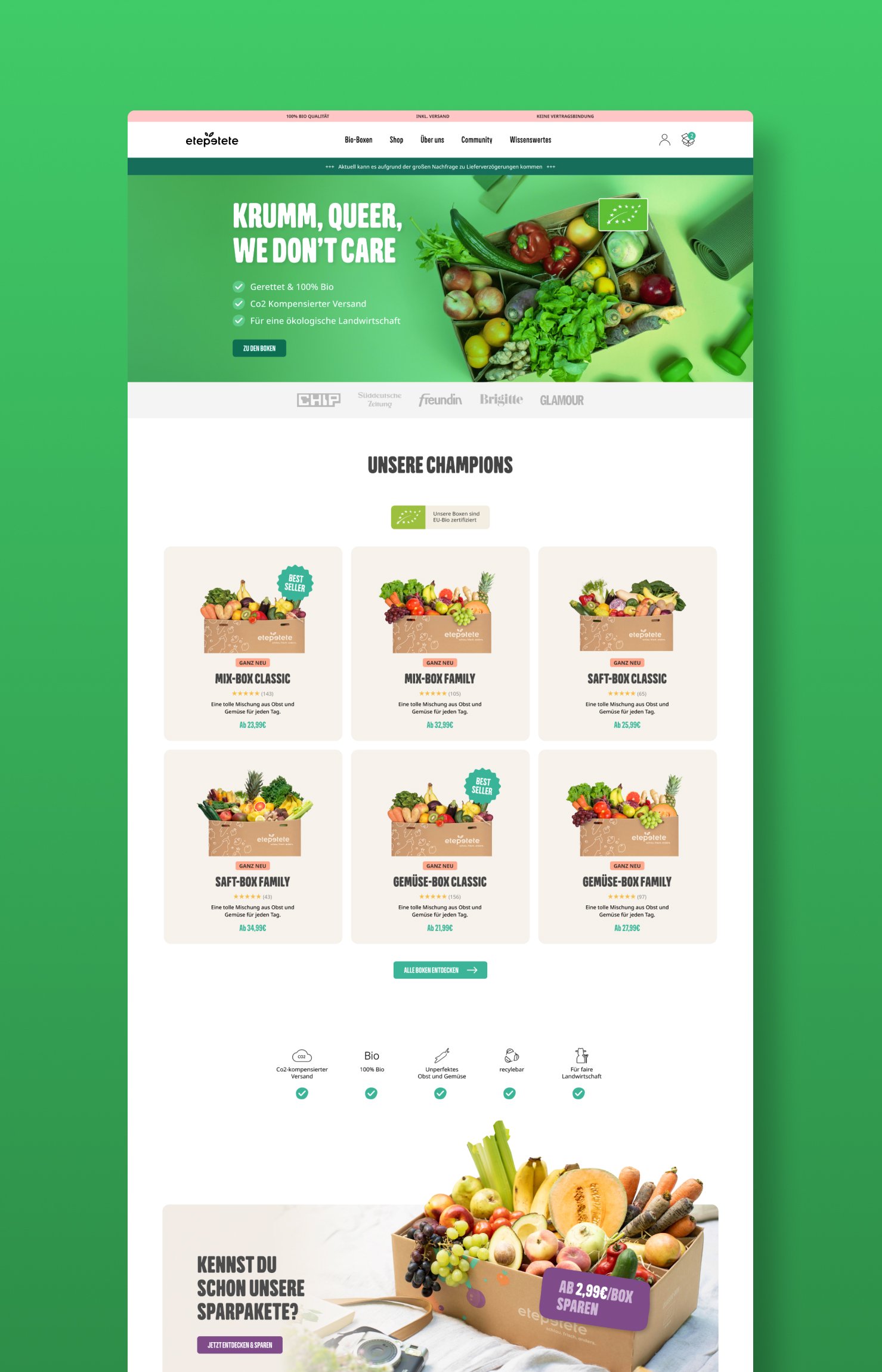
The current pages as the starting point of this project.
Decision Framework
Expected Impact
Increase subscription conversion and reduce early churn risk by strengthening commitment confidence at entry.
Reduce decision friction to protect subscription intent.
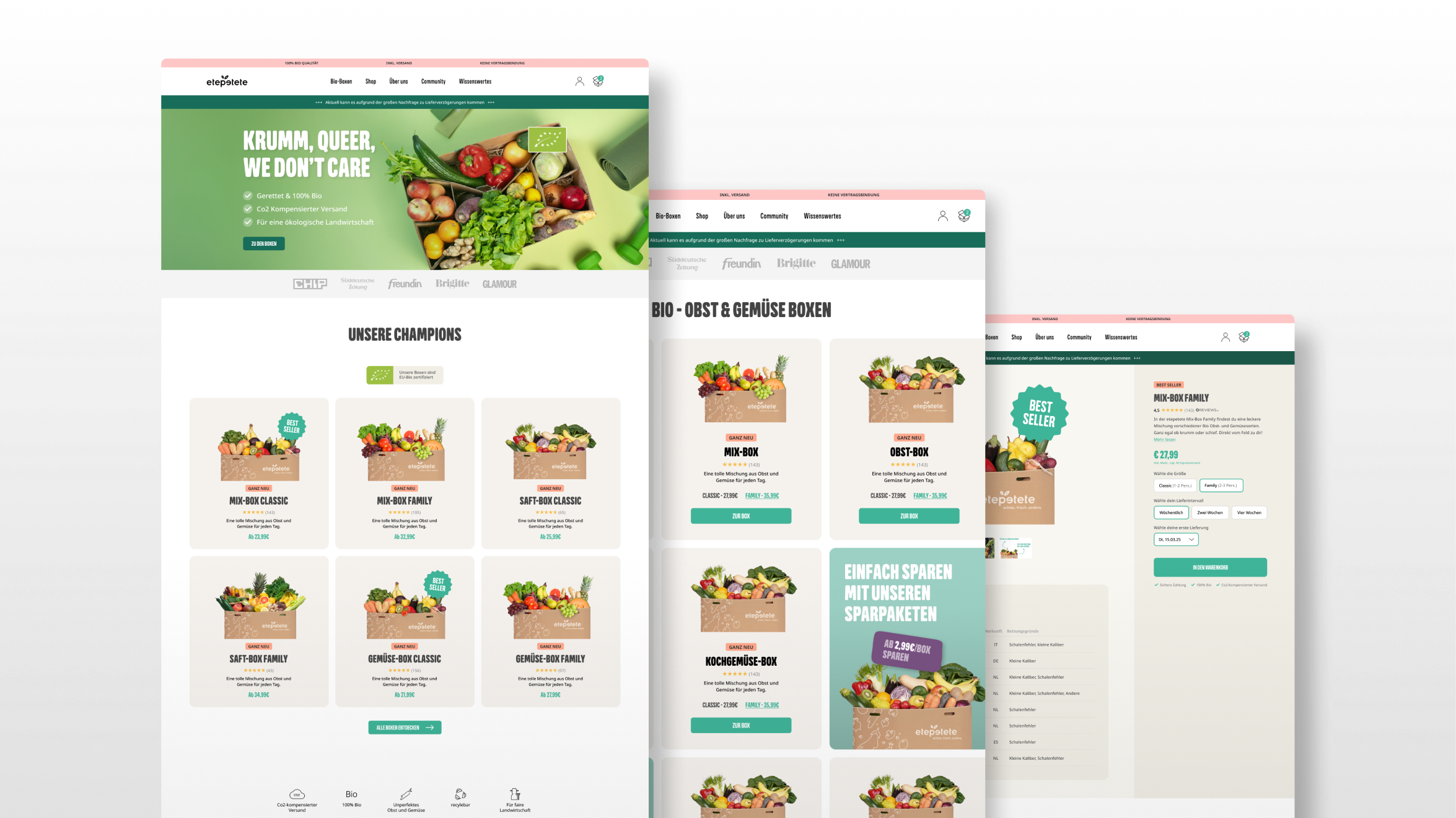
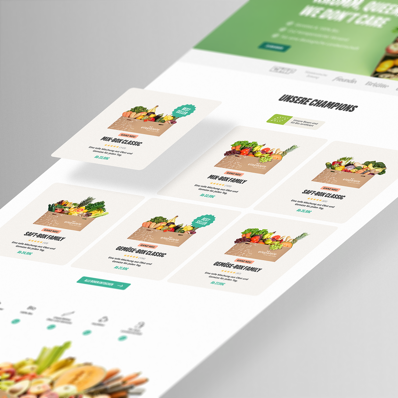
Homepage
Top-performing products were elevated to the primary entry point and clearly differentiated to enable immediate comparison. A simplified hierarchy reduced decision effort, allowing users to grasp key differences at a glance and move faster toward commitment. Also certificates and testimonials are placed on top to gain trust.
Easy choice: Promote best performer only
Build trust fast: Certifications & testimonials placed to the top section
Clear USP & benefits
Clear hirachy of primary and secondary information.
Color interruptions to promote events and special offers.
Expected Impact (Conservative)
8-10% increased Add-To-Card rate
4-6% increase in conversion
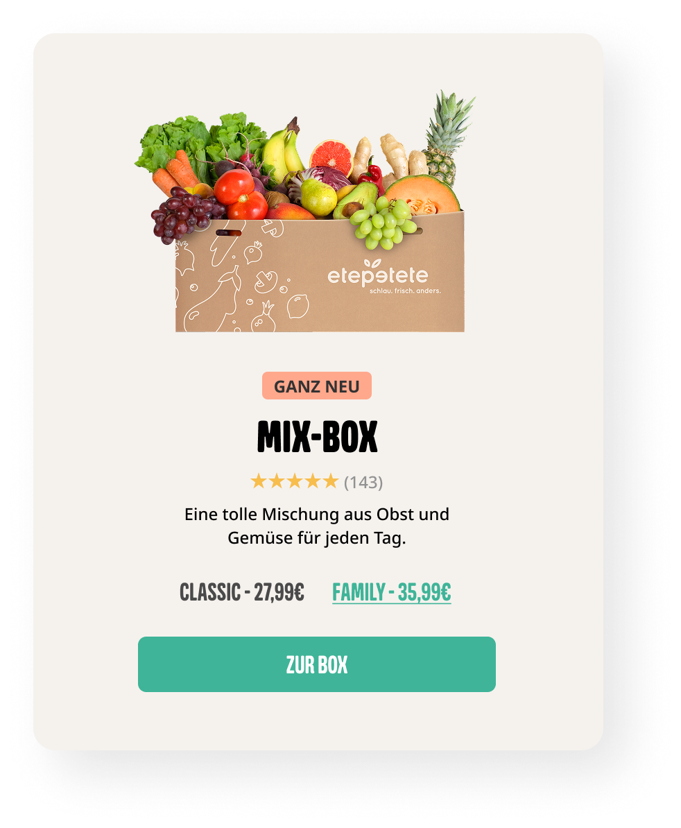
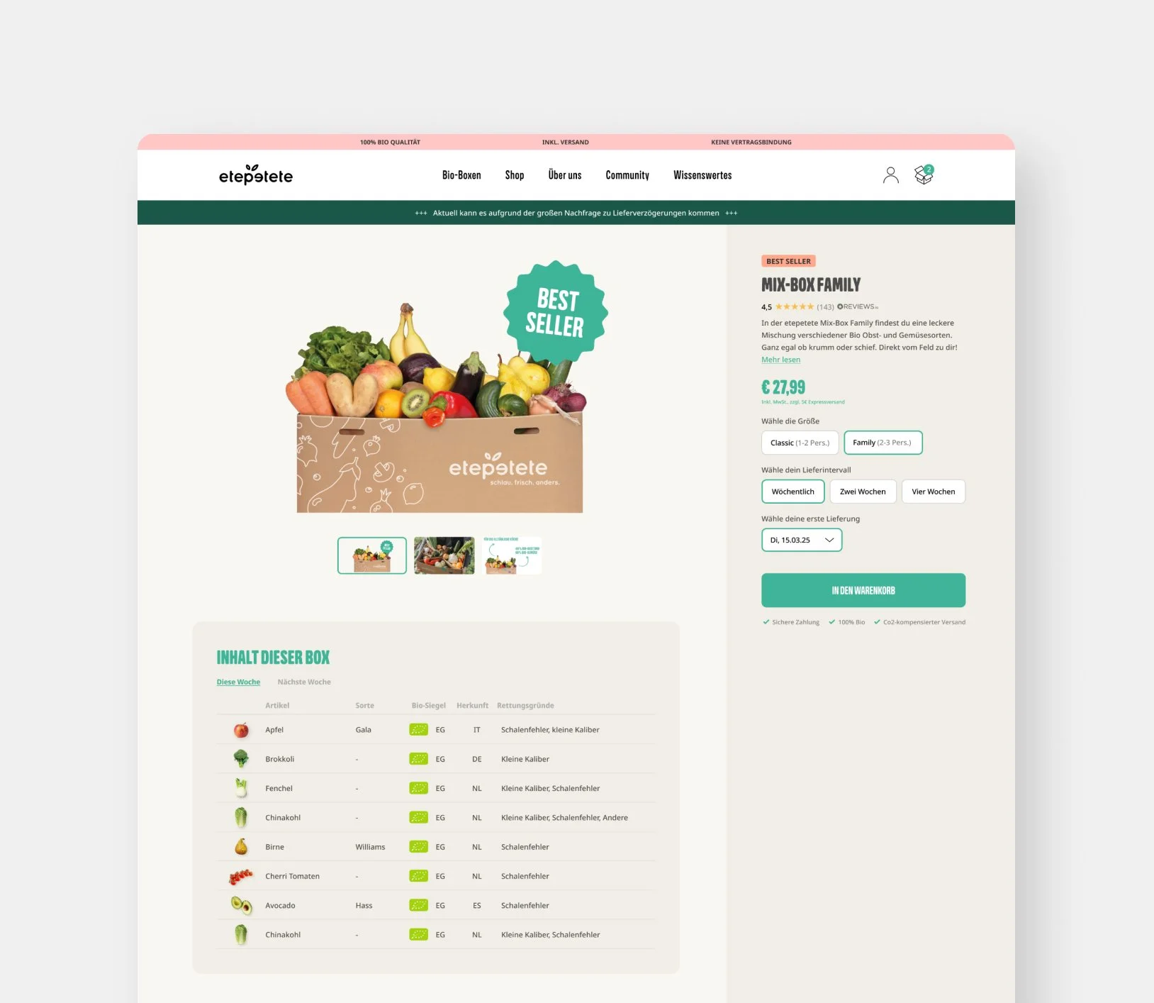
Product Listing Page (PLP)
To enable faster decision-making, customers can preselect the appropriate product size before entering the box configurator. Available sizes and price differences are visible directly on the PLP, allowing users to toggle between options without visiting the product detail page. Customer reviews are also surfaced upfront to reinforce trust.
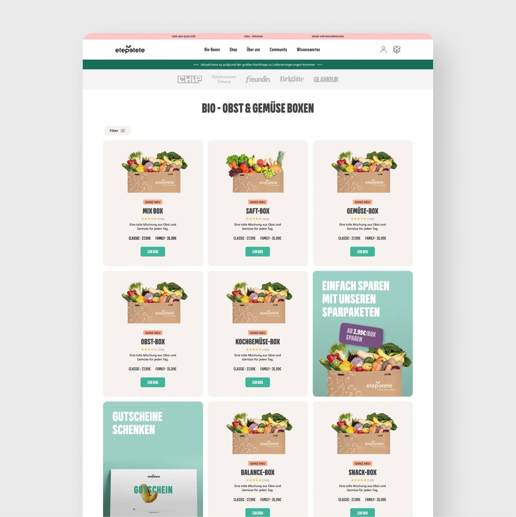
Why this layout
Integrating offers within the product grid treats promotions as part of the assortment rather than secondary marketing content.
Standardized card structure to improve comparability.
Introduced spotlight cards with special events or promotions.
Strengthened visual hierarchy to guide attention and action.
Preselect product size before entering the configuration process.
Added customer reviews to gain trust
Expected Impact (Conservative)
10-14% increased Add-To-Card rate
6-8% increase in conversion
Choosing the right layout
Separate pages
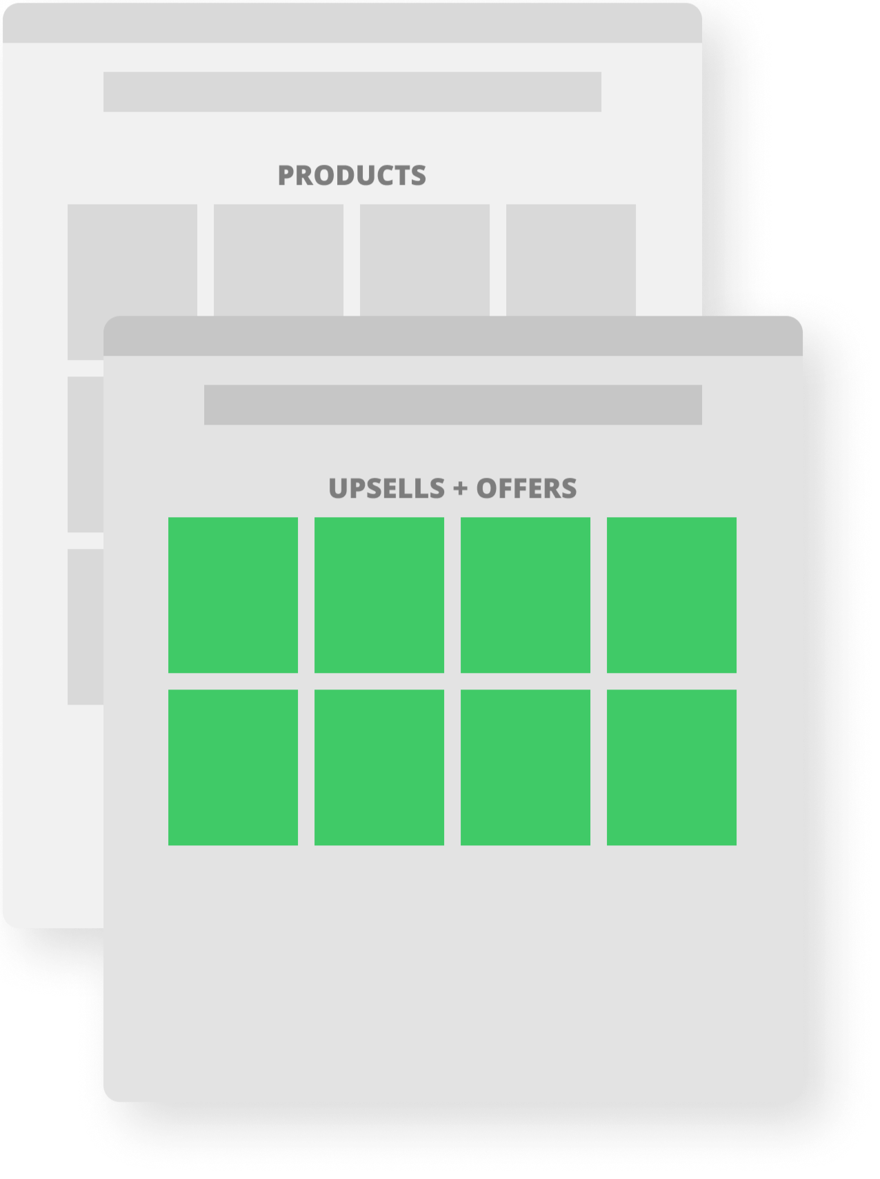
Products and promotional offers are separated into dedicated pages to keep messaging clear and avoid mixing intent.
Limitation: This structure reduces cognitive clarity for the customer journey, as users exploring products may never encounter relevant upsells or limited offers.
Risk: Upsell visibility decreases, reducing opportunities to increase basket value.
Clearly devided sections
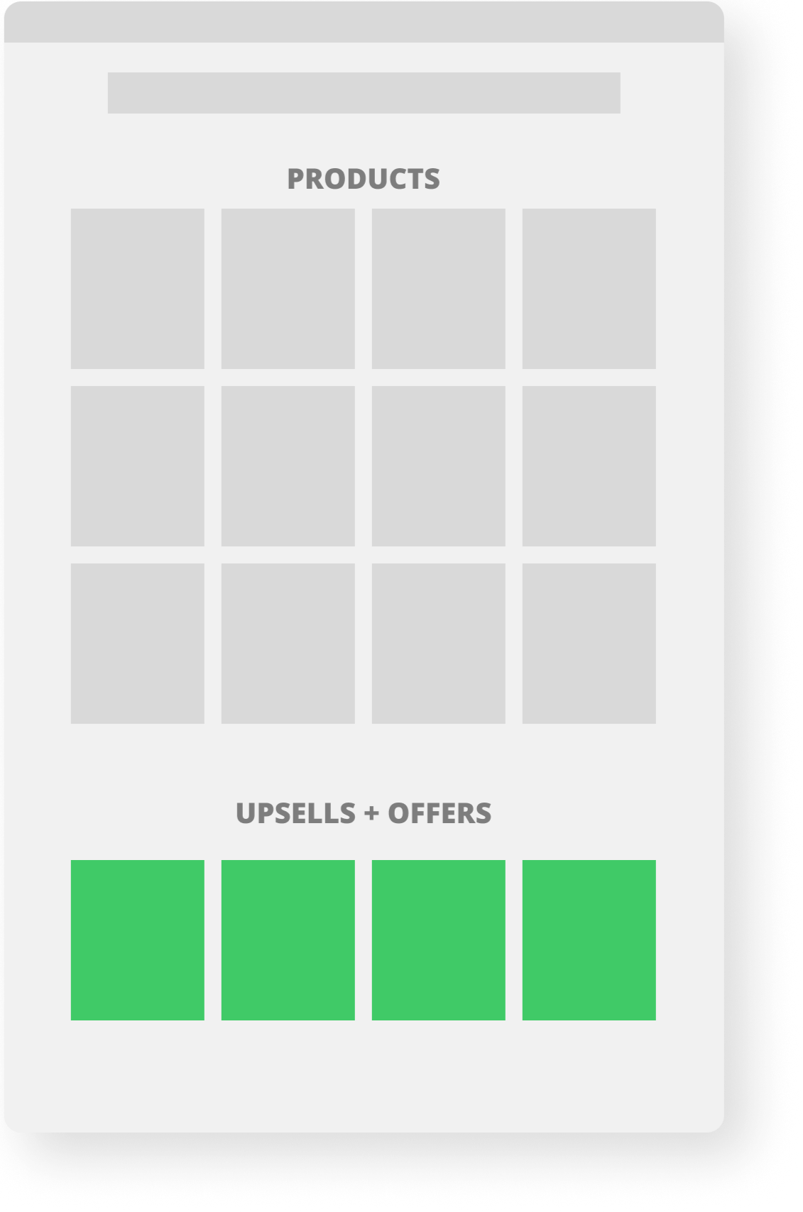
Products and offers are presented within the same page but separated into distinct sections.
Limitation: Because users primarily focus on the first visible product grid, offers placed further down the page risk being overlooked.
Risk: Upsells become secondary content rather than part of the core decision-making process.
Mixed offers (Chosen Approach)
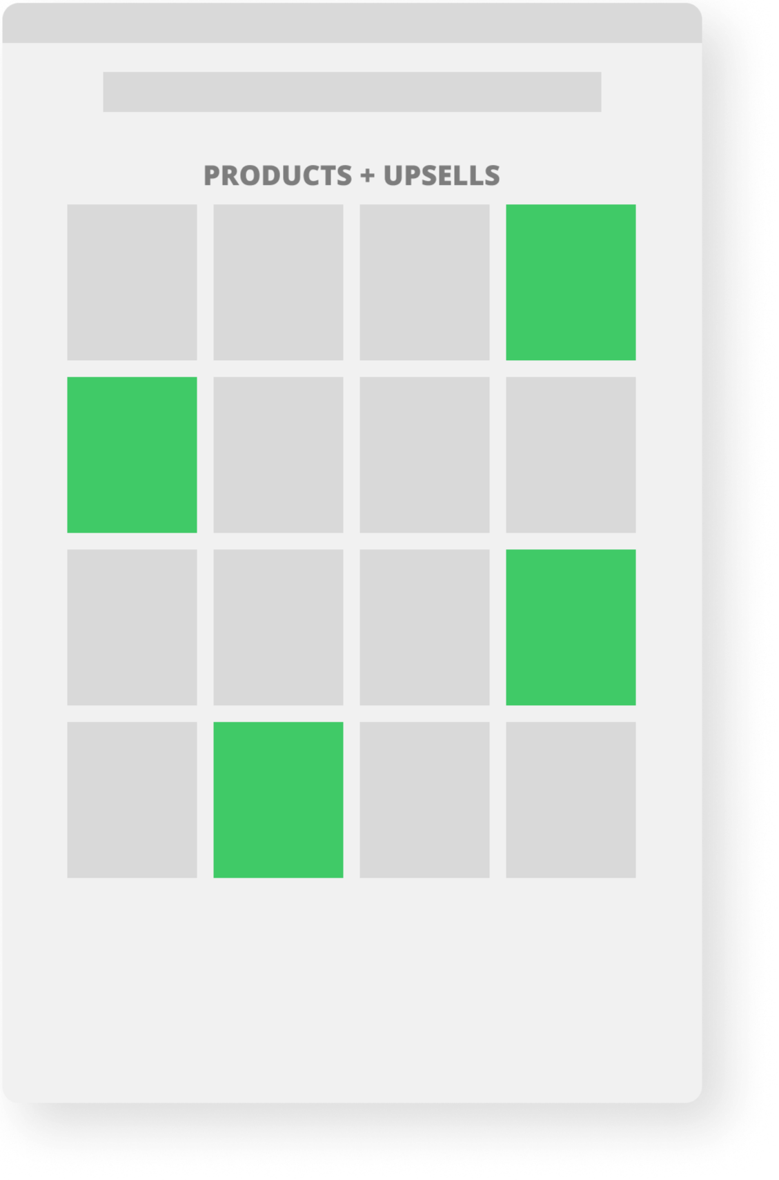
Products and promotional offers are integrated within the same grid, appearing alongside each other during browsing.
Rationale: By embedding offers directly into the natural browsing flow, upsells gain equal visual attention without interrupting the user’s product discovery process.
Expected Impact: This approach increases offer visibility, encourages exploration, and improves the likelihood of higher basket value without adding friction to the purchase journey.
Product Detail Page (PDP)
Separated decision-critical information from secondary details. Understanding what’s inside and how to configure must happen before emotional commitment breaks.
Easy-to-use preference configuation
Detailed box content
Clear hirachy of primary and secondary information
Expected Impact (Conservative)
10-15% increased Add-To-Card rate
8-10% increase in conversion
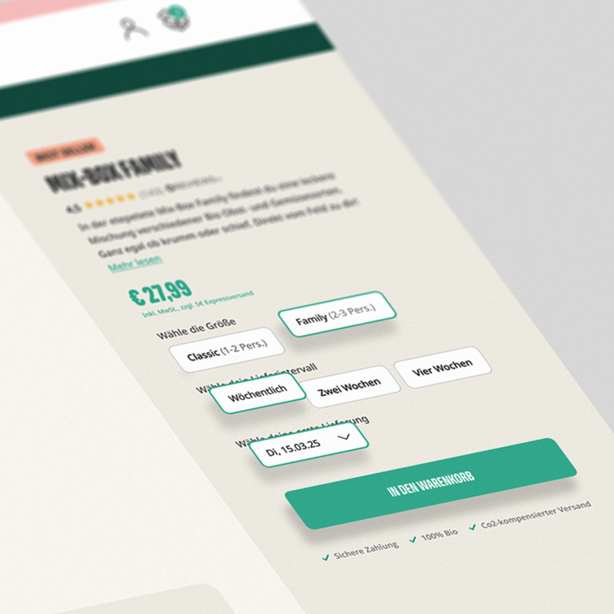
Make configuration settings directly visible and reduce dropdowns to reduce friction.
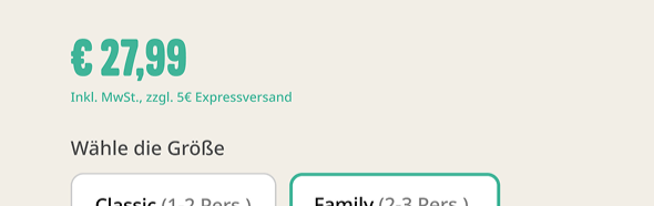
Hypothesis: Price Partitioning
Separating shipping costs from the product price promotes conversion, as the total cost of the product appears lower. As long as the additional shipping costs are communicated early on, there is a high probability that conversion will increase. Testing is crucial here.
Expected Impact (Conservative)
6-8% increased Add-To-Card rate
3-6% increase in conversion
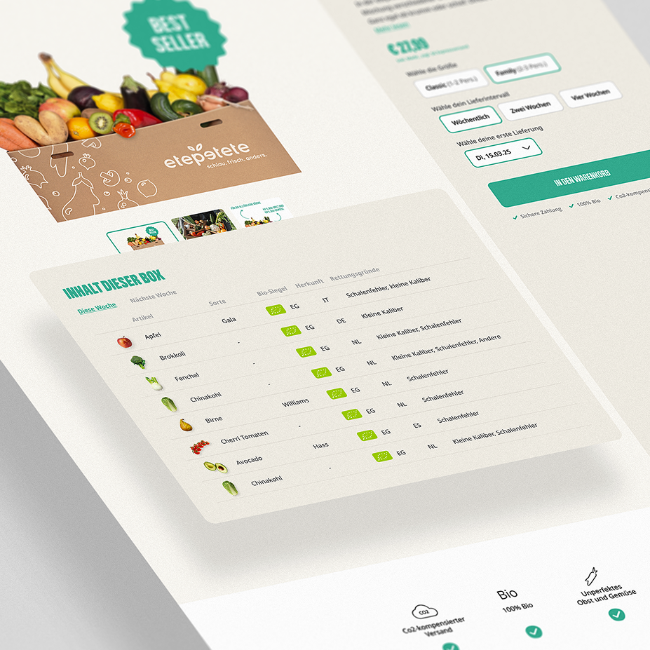
Made box contents transparent before purchase commitment.
Outcome, Learnings & Reflection
Expected Impact
While not implemented (yet), the concept proposes:
Reduced cognitive load during product selection.
Clearer understanding of box contents before purchase commitment.
A more confident and guided decision flow.
Key learnings
Conversion issues are often structural, not visual
Transparency increases confidence more than persuasion